Hey all!
If you’ve been following these posts the past couple of weeks, I hope you’ve enjoyed the informal look at some candy packaging. This entry goes against the format perhaps, but also talks about packaging from a different angle.
If you take a look at the photo accompanying today’s post, you’ll see a close-up of Oh! Henry chocolate bars that are on display for bulk purchase. That’s right: there is no package at all! The bar sells itself on visual appeal alone. Granted, the name recognition helps customers who are already familiar with the well-known candy bar. However, the way the candy bars are displayed is intriguing. The bold-type name on the bin describes the item as “Broken Nut Roll” with the name brand “Oh! Henry” in smaller text. The fact that some bars are BROKEN is played as a virtue rather than a problem. Indeed, the way in which the caramel oozes from the center where the break occurs, revealing peanuts and the slightly darker core of chocolate can be downright irresistible. The appeal is enhanced once the bin lid is lifted and the heady aroma of those three elements grasps the olfactory senses.
Anyone else need a pause to collect and compose?
Yes.
So, as much as a package serves basic functions of protection and presentation in most circumstances, in this setting it is barely missed. In another part of the store where the above photograph was taken, the Oh! Henry 4:25 bar is available in a more conventional wrapper and marketed in it’s own point-of-sale cardboard display. Package designers need not fear their obsolescence! This seemed a good opportunity to showcase another approach to marketing that evokes the past and may serve as a model for the future in a world that needs to be concerned with waste management.
Tom
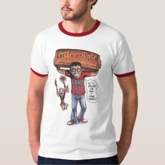
Make sure to follow Tom on Instagram, and don't forget to check out one of his exclusive Candy Critic t-shits.


No comments:
Post a Comment