Hey all!
Time for another look at snack and candy packaging! This time, I want to show you how a company maxed out the box in which their granola bars for kids are sold. The outside of the box is attractively designed with colourful imagery to appeal to kids (and the parents doing the buying). Nature’s Path is a company that sells “Organic” goods like cereals as well as these granola bars. You’ll notice the “Envirokidz” logo as part of the Nature’s Path logo. Also, in the right side of the first photograph, under some bullet points extolling the benefits of the snack itself, it says “SAVE MACAWS”. This might explain the somewhat odd choice of the large image of the macaw on the left side of the package. I say ‘unusual’ since strawberries and macaws really don’t relate, apart from the colour association. One might expect a macaw to be used to promote a tropical fruit mix granola bar. That’s where the next batch of photos come in!
Almost the entire INSIDE of the box is used to present information about the companies efforts to help preserve the Amazon rainforest, home to the macaw.
Also, facts about the macaw are presented.
Finally, kids are given pointers on things to do and habits to pick up close to home to help the planet.
Not only is this a fun way of making kids and parents aware of and perhaps involved with an aspect of preserving the environment but the company actually utilized the inside of the box to present this information! Rather than a website link, which might be ignored (life is busy...) the designers put to use packaging real estate that would be blank and unnoticed. Bravo to the designers for a smart and informative package design!
Tom
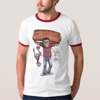
Make sure to follow Tom on Instagram to check out his amazing art. Also be sure to check out one of Tom's exclusive t-shirts that he designed for Candy Critic.


No comments:
Post a Comment