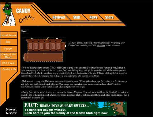
 If you’ve read The Globe and Mail article about Candy Critic you will have noticed the one line about not really being into the look of the site. Well it’s funny because I was just thinking about how badly Candy Critic needed an update. So I’ve decided to give it a shot.
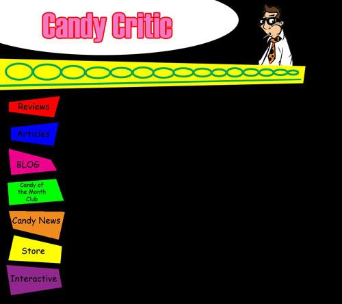
 Here’s one of the looks I’m going for, or at least thinking about. I want to improve the navigation and also make it a little more fun.
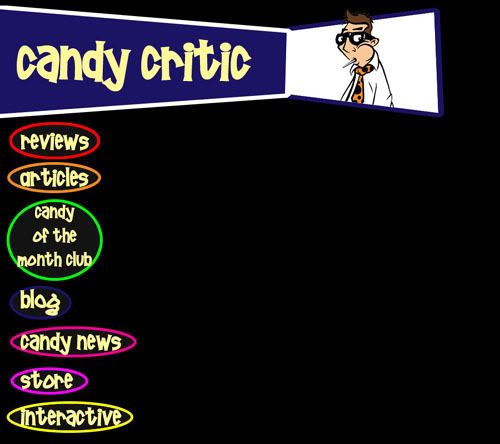
  This is my latest idea; in fact at this point this is the front-runner. If you have any suggestions or ideas on how I can improve the site let me know. For now I’ll be neck deep in code and my inability to have any confidence in my designs.
CC

No comments:
Post a Comment